Bowling Green City Schools
For this project, the task at hand was to create an identity system for Bowling Green City Schools as there is no system in place. Their superintendent, Francis Scruci, hopes to group all Bowling Green schools together on one campus for which they will need a unified identity system. The approach to creating this identity began with finding a way to be inclusive of the schools historic and traditional features along with the district’s idea of expanding and revitalizing. Though the terms seem contradicting within themselves, they all are important aspects of the BGCS identity. The project started as a group project with us collectively deciding on the typefaces, color palette, and approach for the logomark. In the end, we each created our own variations of the logo, identity system, and branding guidelines.
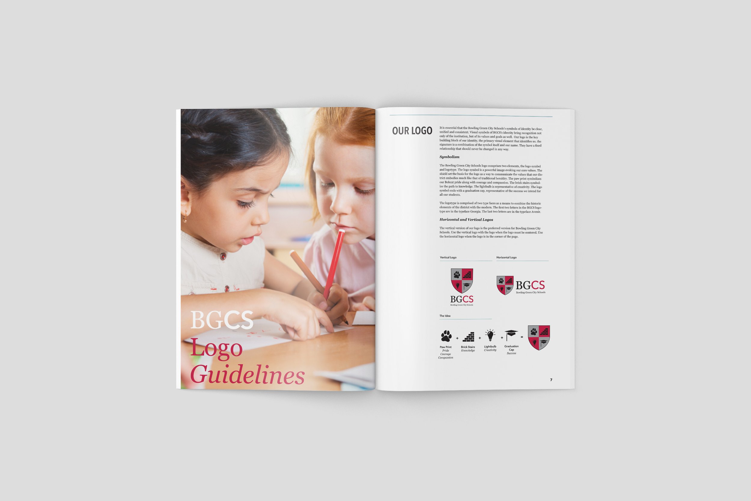
To build the identity, I began with the logo. The approach the group decided on was to create a logo similar to a coat of arms but with symbols that related back to the district’s core values. The shield set the basis for the logo as a way to communicate the values that our district embodies much like that of traditional heraldry. The paw print symbolizes our Bobcat pride along with courage and compassion. The brick stairs symbolize the path to knowledge. The lightbulb is representative of creativity. The logo symbol ends with a graduation cap, representative of the success we intend for all of their students. The logotype is comprised of two typefaces as a means to combine the historic elements of the district with the modern. The first two letters in the BGCS logotype are in the typeface Georgia. The last two letters are in the typeface Avenir.


